
Thursday, 6 May 2010


Original Storyboard
0 comments
- This is a copy of our original storyboard displaying the initial shots, dialogue and settings we planned to use, before making changes later on in the production process.


Tuesday, 4 May 2010
Magazine Front Cover
0 comments - This is a copy of the real Entertainment Weekly's masthead font to act as a template before constucting our own.
 - This is the first draft of our Entertainment Weekly magazine front cover after layering the masthead, issue number, date, barcode and main photograph together. This is the orginal photograph taken before retouching and before separating the featured actors from the background. After creating this first masthead we decided to keep the font fully black as it looks more punchy and slick.
 - This is a copy of the final magazine cover we made after retouching and adding all the nessessary elements needed. Our pink background and fonts aim to attact a young female consumer fits in with the trailer's target audience and is in-keeping with the spirit of the whole Snobs in the City package. The extra circle detail, side-banner and barcode makes the final copy more authentic and helps to grab the attension of the potential buyer. Article side-titles aim to entice the reader and gives clues to the featuring film's backstage information. The photo of the actors in role implys conventions of the film's narrative and the character relationships.
Film Poster
0 comments - This is our very first try at layering the Snobs in the City title, actor's photograph and skyline background together for our promotional film poster. The picture of the actors is before retouching and I feel we have really captured the essence of the film through the facial expressions of the actors. The choice of having a cityscape background was in order to reflect the importance of the film's setting of London. The font chosen for the film title has a strong impact on prospective buyers with the pink lipstick style font for the word 'snobs' portraying the feminine nature of the characters.
 - This is the second draft of the film poster for Snobs in the City. After the first try we realised that the background was the best choice and found that this image would work better as it gives more of the allusion that the characters are within the city as 'professionals' or not-so-much-professionals as the trailer shows. Additionally, we strategically posisitoned the tops of the buildings above the character's heads reflecting their low status within the working industry.
- This is the third and final copy of our Snobs in the City film poster. We added a banner at the top of the poster with the two starring actors names with the first letters in a calligraphy style font in keeping with the 'posh' characters. We also added the tag line of the film in a pink font giving clues to the film's central theme. Another amendment we made was changing the background to a brighter more light-hearted blue giving the image a more appealing look. The institutional information, age certification, film website, "coming soon" and other aspects of retouching all add authenticity. Overall, I feel we have produced a strong and polished promotional poster for Snobs in the City acting as way of establishing and strengthening our campaign.
Monday, 22 March 2010
Preparing for last scene
0 comments

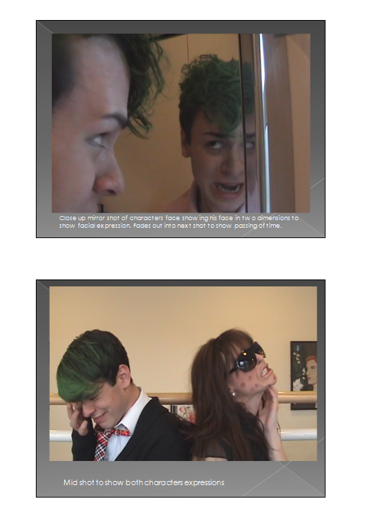
1) Lucy applying make up to create her rash
2) Green hairspray being applied to Charlie's hair to make
it look as though his hair dye has gone wrong
Tuesday, 19 January 2010

Friday, 8 January 2010


Wednesday, 6 January 2010


Tuesday, 5 January 2010

Subscribe to:
Comments (Atom)