
Thursday, 6 May 2010
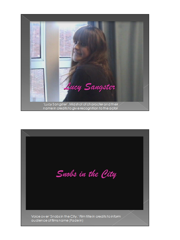


Original Storyboard
0 comments
- This is a copy of our original storyboard displaying the initial shots, dialogue and settings we planned to use, before making changes later on in the production process.


Tuesday, 4 May 2010
Magazine Front Cover
0 comments - This is a copy of the real Entertainment Weekly's masthead font to act as a template before constucting our own.
 - This is the first draft of our Entertainment Weekly magazine front cover after layering the masthead, issue number, date, barcode and main photograph together. This is the orginal photograph taken before retouching and before separating the featured actors from the background. After creating this first masthead we decided to keep the font fully black as it looks more punchy and slick.
 - This is a copy of the final magazine cover we made after retouching and adding all the nessessary elements needed. Our pink background and fonts aim to attact a young female consumer fits in with the trailer's target audience and is in-keeping with the spirit of the whole Snobs in the City package. The extra circle detail, side-banner and barcode makes the final copy more authentic and helps to grab the attension of the potential buyer. Article side-titles aim to entice the reader and gives clues to the featuring film's backstage information. The photo of the actors in role implys conventions of the film's narrative and the character relationships.
Subscribe to:
Posts (Atom)